
A while back, a colleague at work gave me one of his new MOO MiniCards advertising his online photography portfolio. It was about half the size of a normal business card, which was already cute and unique, but more so when he fanned out a few and flipped them over to show that each one had a different photo printed on the back! I spent some time looking through them and chose the one I liked to keep. Walking away, I thought, “This is such a clever idea!” Especially for photographers, turning business cards into a pocketable portfolio just makes a lot of sense. The act of giving a business card becomes an interactive activity and a great way to start a conversation.
I’d seen MOO cards advertised online and in magazines and always thought they’d be cool to try, but until I was actually given one I didn’t put much serious thought into ordering a set. Recently I did look into putting together a set of cards for myself and wanted to share the steps I went through to prepare my images as well as my impressions of the final product.
Image Preparation with Lightroom
Whenever I send an image to be printed by a third party I try to find out as much about the printing process as possible and send the best possible image. Companies try to make uploading images as easy as possible, allowing multiple resolutions, aspect ratios, and file formats, and that’s fine. I understand why they do it and it’s not like the results you get by not caring what you upload are bad, it’s just that they can be better if you know what you’re doing and take the time to properly prepare your images. I used MOO’s recommendations on using your own photos as a starting point.
I used Adobe Lightroom 4, Adobe Photoshop CS6, Nik Color Efex Pro 4, and Nik Sharpener Pro 3 to process my images. The Nik tools you don’t really need, but I used them because I had them and they do some things better than just using Photoshop alone. You can also get by without Photoshop if you only have Lightroom. I do have a color-calibrated monitor and if you’re expecting to get a close screen-to-print match, I assume that you do too. I also use a PC running Windows 8. The basic steps will be the same on a Mac, but the details might be a little off. All of the images I used had been edited previously for upload to my website and for printing—so I was already starting with well-processed images.
MOO MiniCards come in sets of 100. Given that each card can have a different back, that’s 100 images I needed to prepare (you don’t have to have 100 different backs, but I have more than enough usable images so 100 was my goal). I started in Lightroom, went through all my best photos, and picked ones I thought would work with this unique, slender aspect ratio. I added them to the Quick Collection and ended up with about 180. Then I added these to their own “Moo MiniCards” collection, creating new virtual copies of each so I could re-crop them to MiniCard size and not lose my original crops of these images. In the Develop module, I cropped the first one to a custom 8.74 x 3.78 ratio. With this image selected in the Filmstrip, I Shift+clicked the last image—selecting everything—and synced using only the “Crop Aspect Ratio” setting. This set all images to the MOO MiniCard aspect ratio. I then went through each image and adjusted the crop, making sure important details were not only not cropped out, but not close to the edge of the crop either, knowing that MOO would be trimming away about 1/8” on each side. Once I had all images cropped, I picked my favorite 100 in this set. For simplicity later, I wanted all images in landscape orientation. In Grid View, I Ctrl+clicked all images in portrait orientation and clicked the little “Rotate Photo Counter-Clockwise” arrow in the bottom left of one of the cells. This quickly had all 100 images in the same orientation and ready to be exported.

If you only have Lightroom, or want to take a few shortcuts, you can export your images in a MOO-acceptable format right now. The important export settings you want are Image Format: JPEG, Color Space: sRGB, Quality: 100, Resize to Fit: Width & Height (W: 874, H: 378), Resolution: 300 pixels per inch, Sharpen For: Matte Paper (Amount: Standard), Metadata: Copyright Only. These images are the ideal size and resolution for MOO MiniCards and can be uploaded to moo.com as is. They won’t have any of the additional brightness or color corrections that I added to mine, but you should get back a decent set of cards.
If you want to stick with me through the advanced prep, I recommend doing the resizing and color conversion in Photoshop. You’ll want these export settings: Image Format: TIFF, Compression: None, Color Space: ProPhoto RGB, Bit Depth: 16 bits/component, Resolution: 300 pixels per inch, do not resize, do not sharpen, Metadata: Copyright Only. Export just one image for now. We’re going to create an action in Photoshop that can be run on all of these images automatically straight from Lightroom when we export the rest of them.
Advanced Image Preparation with Photoshop
I knew that images from MOO’s HP Indigo 5500 printer on matte, laminated paper would be a bit duller and have less pop than the images coming out of my Epson R3000. In order to give MOO’s prints a fighting chance, I wanted to add a little brightness and vibrance in Photoshop. MOO also suggests converting to CMYK with the Coated GRACoL 2006 profile. This is the color space used by the printer, meaning no conversion would be done on output, resulting in the most accurate color. Also, knowing that MOO prints at a resolution of 230 lines per inch (I asked) I was able to use Nik Sharpener to dial in a perfect amount of sharpening for the final output.
I opened the one TIFF I exported from Lightroom in Photoshop and created an action that performed the following steps:
- Make Exposure adjustment layer, set Exposure to 0.33 (this adds just a little brightness)
- Flatten Image
- In Color Efex Pro 4 use: Brilliance/Warmth with Saturation at 10% and other sliders at 0% + Pro Contrast with Correct Color Cast at 0%, Correct Contrast at 15%, and Dynamic Contrast at 30%, Shadows and Highlights at 0 (this adds a touch to the saturation and applies a nice contrast pop)
- Flatten Image
- Image Size: Width 874 pixels, constrain proportions, bicubic automatic interpolation
- Duplicate current layer
- In Sharpener Pro (Output) use: Halftone, Viewing Distance: Auto, Paper Type: Coated, Printer Resolution: 230 lpi, Output Sharpening Strength: 100%, All other siders at 0%
- Select the sharpened layer and set the layer blending mode to Luminosity
- Flatten Image
- Convert Image Mode to CMYK
- Edit, Convert to Profile: Coated GRACoL 2006, Relative Colorimetric, with Black Point Compensation
- Convert Image Mode to 8 Bits/Channel
- Save Image as JPEG, Quality 12
- Close
If you don’t have the Nik software collection, I’d replace the Color Efex Pro step with something like:
- Make Vibrance adjustment layer, set Vibrance to +6, and set Saturation to +6
- Make Curves adjustment layer, use Preset: Medium Contrast (RGB)
And the Sharpener Pro step with a conservative output sharpening:
- In Filter, Sharpen, Unsharp Mask use Amount: 100%, Radius: 1.0 pixels, Threshold: 3 levels
Once the action is created, create a Droplet to use with Lightroom under File, Automate, Create Droplet. Choose a location to save the Droplet by selecting the “Choose…” button at the top of the dialog. Select the action you just created, and leave all other settings at their defaults. Back in Lightroom, in the Export dialog, scroll down to the last step, Post-Processing. In the After Export drop-down, choose “Go to Export Actions Folder Now”. This will open Windows Explorer to the location where Lightroom presets and actions are stored. Copy the Droplet .exe file created from Photoshop to the Export Actions folder. Back in Lightroom once again, you should see the Droplet you copied into the After Export drop-down now. By choosing this Droplet here, when you export your files from Lightroom, Photoshop will automatically open each exported file, run the action you created, save, and close. Pretty cool! Select all 100 photos you want to export in Lightroom, export using the TIFF export settings above, with your Droplet selected in the After Export drop-down, and let it run! You should see Photoshop open after the Lightroom export is complete and see 100 JPEG files next to the 100 TIFF in a short amount of time.

To get an idea of what your exported JPEGs should look like printed, open them in Photoshop and soft proof with the Coated GRACoL 2006 profile. When the image opens in Photoshop, make sure to “Use the embedded profile”. To soft proof, select View, Proof Setup, Custom. Select “Coated GRACoL 2006 (ISO 12647-2:2004)” under Device to Simulate, Rendering Intent: Relative Colorimetric, Black Point Compensation, and Simulate Paper Color. Ctrl+Y will flip back and forth between proofed and non-proofed so you can see how the final print will dull. I suggest viewing in Photoshop at 50% to judge apparent sharpness.
Now, if you’re really picky, instead of doing the automated action with basic exposure, saturation, and contrast boosts, you could open each image in Photoshop one by one, turn the soft proof on, and make separate color adjustments for each one. I didn’t want to spend that kind of time on this though and I think my automatic settings were good enough for most of my images.
Setting up the Information Side of your MiniCards
MOO has some default layouts for the information side of your MiniCards which you can use right from their website, but if you want to design something on your own, it’s not too hard. I used Photoshop, but if you’re familiar with vector-based tools like Illustrator or InDesign you could certainly use those too. You want to make sure you follow the MOO template when designing your card, however. You have to leave room for a “bleed” (the part that will be trimmed away to make sure you have no white edges on your cards) and need to keep all text inside the “safe area” (the area guaranteed not to be trimmed away). You can download templates from MOO’s website.
When creating an image with text for the information side of your card, I highly recommend converting text to shapes and saving it as a PDF. This will ensure that your small text doesn’t become pixelated. Once you have your design, convert to CMYK and the Coated GRACoL 2006 color profile as described for images above. Then convert your text to shapes and save the PDF using the preset PDF/x-1a. MOO’s website has good information on this.
Uploading to MOO
Once I had my images exported from Lightroom and Photoshop and my Information side PDF saved, I found uploading and ordering my cards at moo.com very easy. Just follow the on-screen instructions for ordering MiniCards. When you get to uploading your images, you can just select all 100 at once. MOO will upload them all and apply one photo to each card. Be sure that you have turned off any automatic photo enhancement—if you’ve followed the steps here, you’ve got that part covered!
Final Product
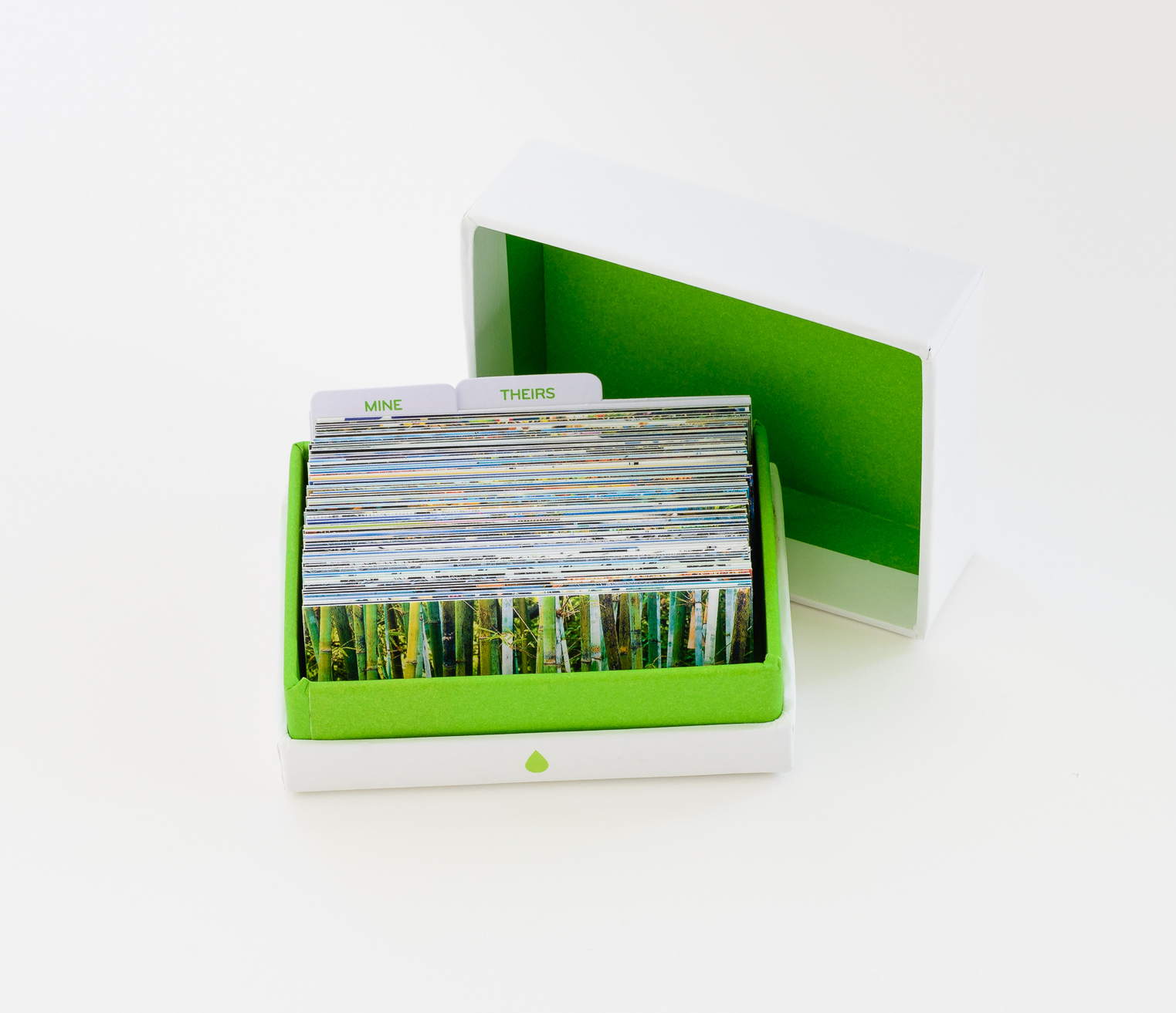
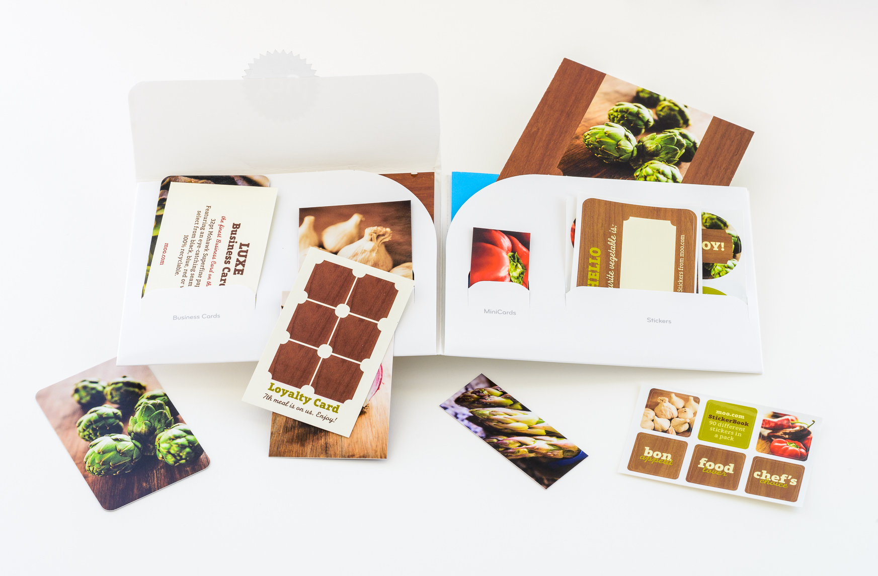
After I placed my order with standard shipping, MOO estimated that I’d get my cards in about two weeks. In reality, I got them in about half that time. I ordered 2 boxes of the 100 MiniCards I’d made in smooth matte, along with all three of the MiniCard cases they offer. My shipment arrived in a bubble-pak envelope. The cards were well protected in sturdy boxes of 100 cards each. I also received a sample pack that included examples of all of the MOO products and finishes including the standard-size business cards, stickers, postcards, and greeting cards.
Overall, I’m very happy with the quality of the MiniCards I received. The print quality is excellent and I really like the classic MOO matte laminate finish. It feels good in your hand and has a nice, velvety quality. I was curious about the gloss option too so was happy to see one in the sample pack. I much prefer the matte laminate finish. Even though photos on the gloss finish had more pop, the feel wasn’t as luxurious. The gloss certainly has its place and may be better suited for another product like the postcards, but I’m sticking with the matte laminate for all future MiniCards.

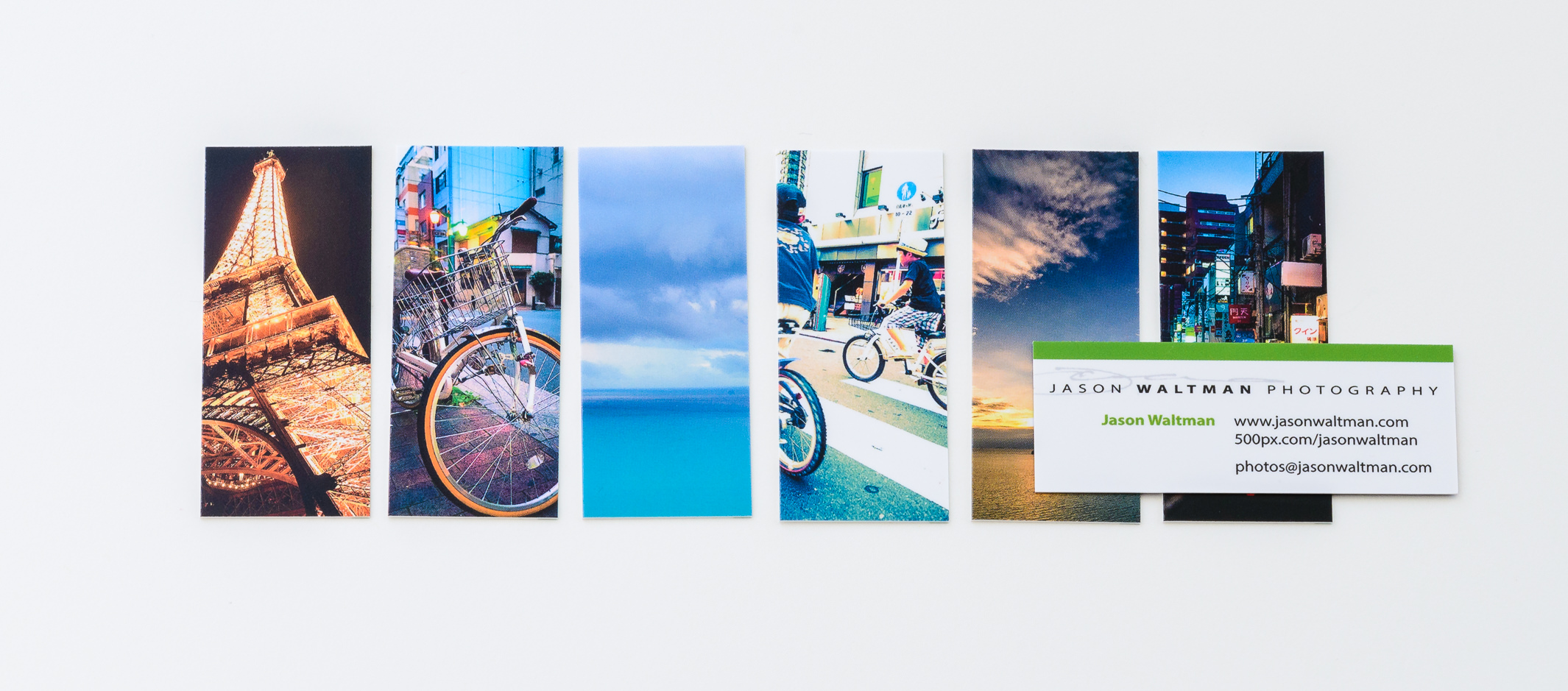
I’m very happy with the way the adjustments I made to brightness, contrast, and sharpening came through in the final product. I didn’t feel like any of my images were dull or underexposed and the amount of sharpening that was applied by Nik Sharpener for the halftone printer seemed appropriate. The colors of the final cards matched pretty closely to what I see on my computer monitor when soft proofing in Photoshop. It’s not a perfect match, but within a threshold I’ve come to expect from screen-to-print matching. If I had one color complaint it would be that yellows and oranges tended to shift warmer towards orange and red in the final product. Not a lot, just enough that I noticed. It doesn’t bother me and I’m not really sure if I’d do anything about it if I printed again. It’s possible that not all of my images needed the saturation boost I added in Photoshop. Printing so small, I noticed that if I had a photo with fine detail or text that that detail gets lost. That was expected though and clearly visible in the down-sized JPEGs I uploaded. As mentioned, the final images were clearly sharp. I did notice a little aliasing on sharp, graphic, diagonal lines. This too was somewhat expected and visible in my JPEGs. It’s clearly due to the amount of sharpening I applied. I don’t have many images with these types of features though, so the benefits of sharpening on the majority of images outweigh the minor aliasing on a few. I suppose if you have lots of graphic elements in the majority of your images you might want to turn down the sharpening just a little.
MiniCard Holders
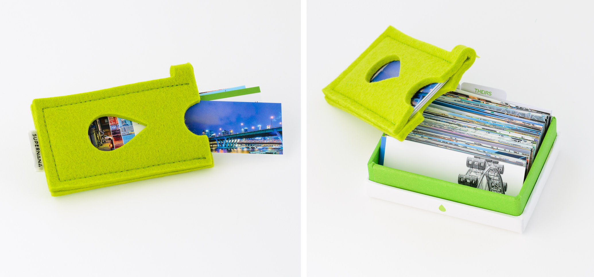
I ordered all three MiniCard holders offered by MOO as I couldn’t decide which ones would work best for me and I wanted to try them all. The MOO MiniCard Holder seems to be the most versatile. Made of hard plastic, it holds 12 cards and protects them well. It’s pretty small and fits easily into a pocket. It also comes with a key chain ring if you want to attach it to your keys (I prefer to carry as little as possible on my key chain, so I’m leaving mine off). At only $5, everyone who orders a set of MiniCards should get one of these. The felt holder I’m a little disappointed with. I like that it’s felt and therefore doesn’t bang around against keys or my phone in my pocket like the plastic holder does, but it’s just two pieces of felt sewn together so I find getting cards in and out without damage to the corners a little difficult. There’s no way I can store 12 cards at a time in the felt case as the MOO website suggests. I feel safer with 6-8 cards at a time. A nice idea that just doesn’t work well in practice (but hey, they do come in lots of fun colors!). I ordered the leather holder because it can hold 45 cards. In practice, I feel like 40 is a better maximum. It’s the most expensive case at almost $20, but well made, and easy to throw in the bottom of my camera bag when traveling to store a backup supply of cards.


What Do Others Think?
Giving away these cards has been a lot of fun. Everyone has such a great reaction. First, they’re intrigued by the small size. It’s not the typical business card size, but something cute, fresh, and modern. Then, they’re impressed that every card has a different image on the back. Instead of just taking a card I give them and not giving it a second thought, now they take the time to look through a few and pick the one that they like most. I really like this because recipients feel like they get something that they want which will mean more to them than just another business card. I also don’t feel like I’m pushing something unwanted on someone this way. I’m hoping these cards make good conversation starters when I’m out traveling around the world, too.

Use my referral link and get 20% off your first order at moo.com!
I hope this review and set of tips that I used to prep my cards has been helpful. If you decide to make your own cards, you can get 20% off your first order at moo.com by using the referral link below.
https://refer.moo.com/s/jason166
If you have questions I didn’t address here, leave them in the comments! Good luck making your own MiniCards!
What a great blog post. I’m not too familiar with paper printing options, but this is an excellent tutorial. I ordered my mini moo cards too, but just used the online tools at moo. I’m happy with most of the photos I chose, but there are a few that could do with brightening up a little.
Thanks for stopping by, Martyn! Glad you like your MiniCards!
Hi, great tutorial, ingenerally print from home so don’t need to worry about this sort of thing, but obviously business cards are a must, would these settings apply for the standard size too? I also used photoshop and nik
Hey Alex, Thanks! Yup, the same workflow (apart from size) should work well for anything being printed by Moo! I just had invitations printed and went back to this post myself to remind me how I’d done it in the past and the results were excellent. The only thing I skipped this time around was the extra saturation boost, which I mentioned toward the end, above.
Having a properly calibrated monitor with proper print brightness is important, but hopefully you already have that if you’re printing from home like I do (most people have their monitors set too bright and prints end up looking too dark). Also, it’s important to convert text or any vector art to shapes and save as a PDF if you want those elements to come out sharp,
I think you’ll love the print quality from Moo. Best of luck!
hi Jason,
thank you for your reply, i got a little held up with the order but will be ordering soon, can i just double check the CMYK conversion, i am in the uk and the standard here is FOGRA 39, should i stick to the Gracol?
You can double-check with MOO directly if you want to be absolutely sure (I usually send them my formatted art to check before submitting myself), but yeah, I’d say stick with their Gracol conversion.
Great post. I’ve used Moo for printing my business cards for years and came across this when prepping images for a larger, postcard-size project. Thanks for your detailed information as well as your inclusion of the Nik settings as I have that package and never really used the Sharpening tools included.